Auto Rental Web Service
The goal
Since the advent of digital engagement in the auto rental industry, online rentals have become an essential service. However, many users face challenges such as confusing navigation, inefficient search functionality, and a lack of service transparency. This case study explores how redesigning the user experience for online car rental improved satisfaction and engagement.
Users reported frustration with the existing platform due to:
Product details displayed insufficiently
Costs and fees not readily disclosed
Lack of a concise customer journey
Lack of appropriate feedback
Complicated checkout process
Lack of clear categorization
Research:
Competitive Benchmark
An analysis of features from top competitors to identify best practices
It was concluded that the optimal experience provides an imperceptible service, entrusting control to the hands of the customer. A clear path helps them accomplish each task and neatly ushers them to the next. Completion of a successful customer journey fosters trust and confidence in the User.
Research:
Usability Test
An evaluation of how easily users can interact with a digital product
Users were observed walking through a structured customer journey, noting positive experiences and pain points. It was observed that the most favorable points of interaction were highly navigable, simple, and intuitive. Common words of praise included “straight-forward”, “clear”, and “transparent”. The Users expressed gratitude when their expectations were met. Instances where comprehensive information was delivered neatly and in a timely fashion were highly valued, as were small touches such as color-coding and options to access additional information or details. Users were more likely to express dissatisfaction with the interface when posed with ambiguity, uncertainty, or a glut of unsolicited information. Often times, Users were flummoxed by industry jargon, impacting their confidence in themselves and the service.
Analysis:
Affinity Diagram
The qualitative data gathered was organized and categorized
Using the research gathered, the Affinity Diagram aims to create linear threads through unstructured data. By observing all raw data unilaterally, the team is able to sift out patterns and themes, thus driving consensus. Team members were acquainted with the raw materials then asked to articulate their impressions onto post-it notes. These notes were then presented together as an ungoverned mosaic. From this point, commonalities and themes were explored and sorted into broad, then granular categories. Lastly, the notes were color-coded to indicate a positive interaction, pain point, or User question or observation.
Analysis:
Customer Journey Map
Tracking User flow via their goals, behaviors and emotions
Now that the raw data has been analyzed, the Customer Journey Map serves to factor a key element into the design process, that of flow. In its essence, the Customer Journey Map puts us into the shoes of the User; we see the goals, behaviors and emotions involved in their decision-making. Extruding the steps of the process helps us hinge the data onto a breathing framework where the hints of its broader impact begin to show. We have mapped the User’s Goals, Behaviors, their Positive Interactions and Pain Points through the steps of the journey, contending each to the rubric of Mental Models.
Concept:
Flow Diagram
A visual representation of the steps a User takes to complete a task within an interface
The diagram documents the User’s journey from Homepage to Search Results, Product Extras, Booking Summary, Payment, and Confirmation.
Concept:
Interaction Design
Turning a focus on creating intuitive and seamless User interactions with the platform
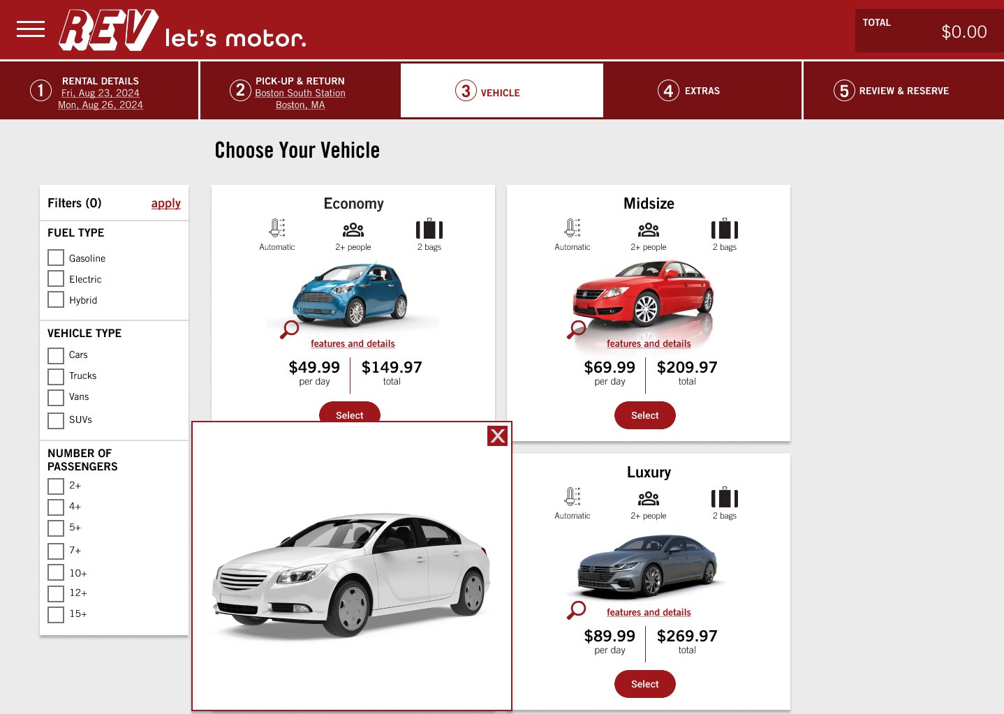
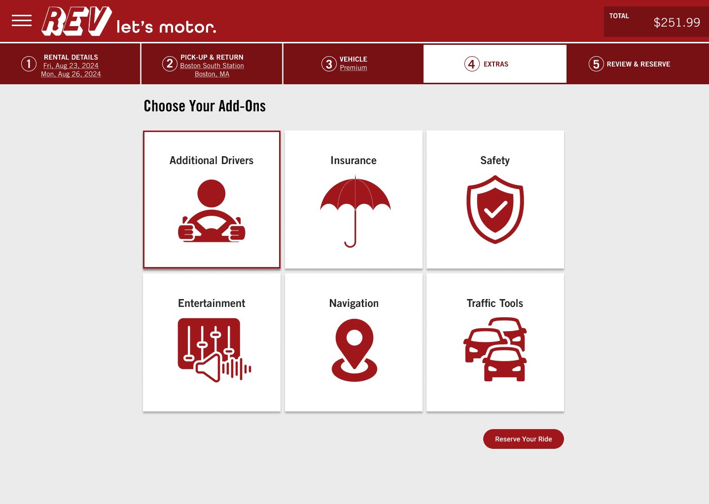
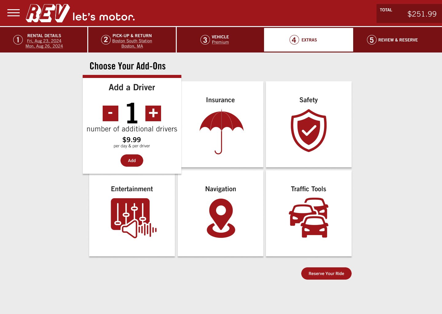
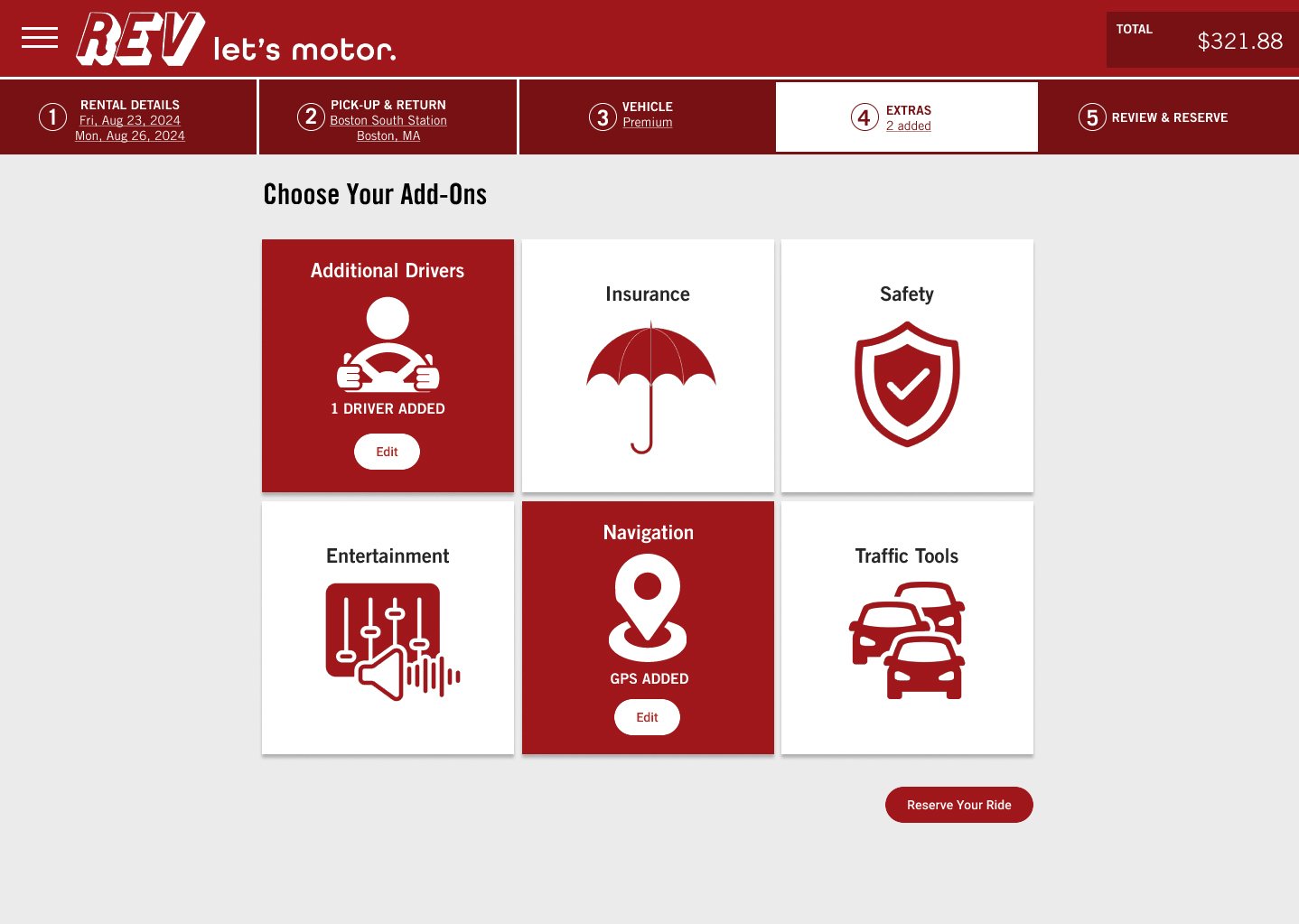
The construction of responsive screen states establishes clear affordances, progressive disclosure, and feedback.
Design:
Prototype
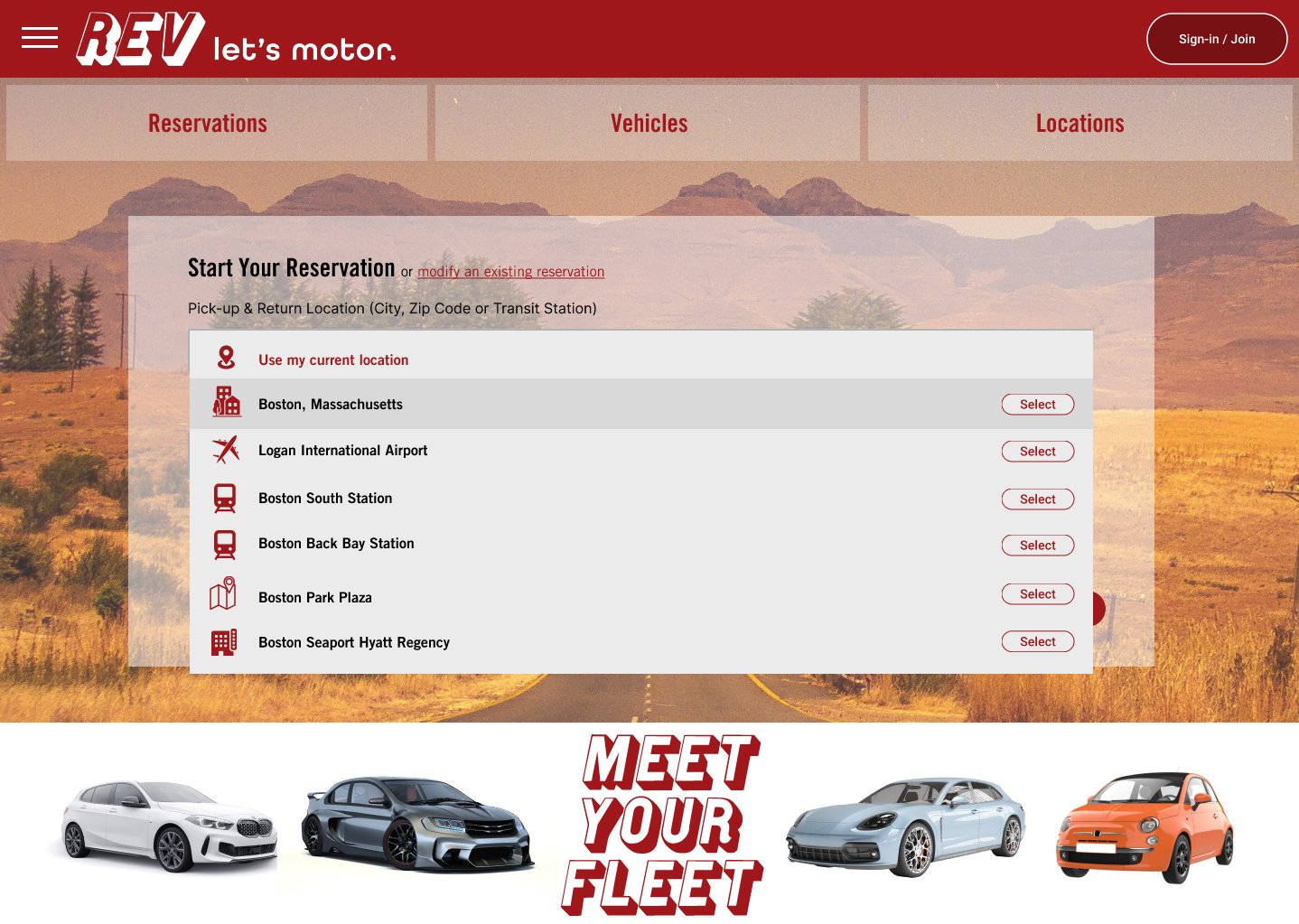
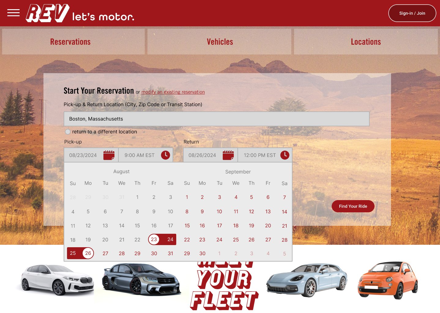
Using Figma, a high fidelity prototype was created including:
A Home Screen search bar with auto-complete suggestions
Product Search featuring interactive filters and quick view modal components
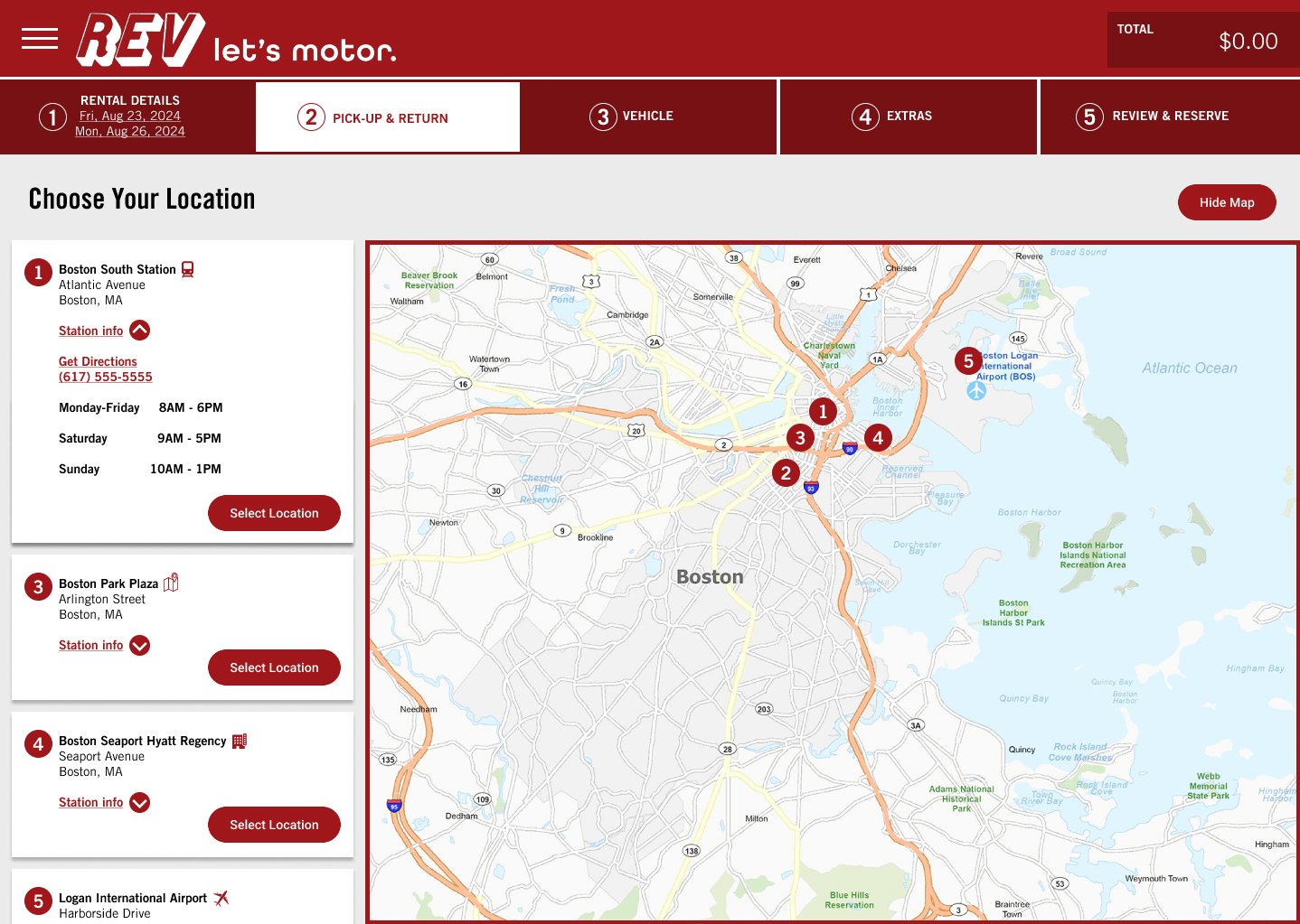
A User Journey bar including real-time updates and progressive loading animation
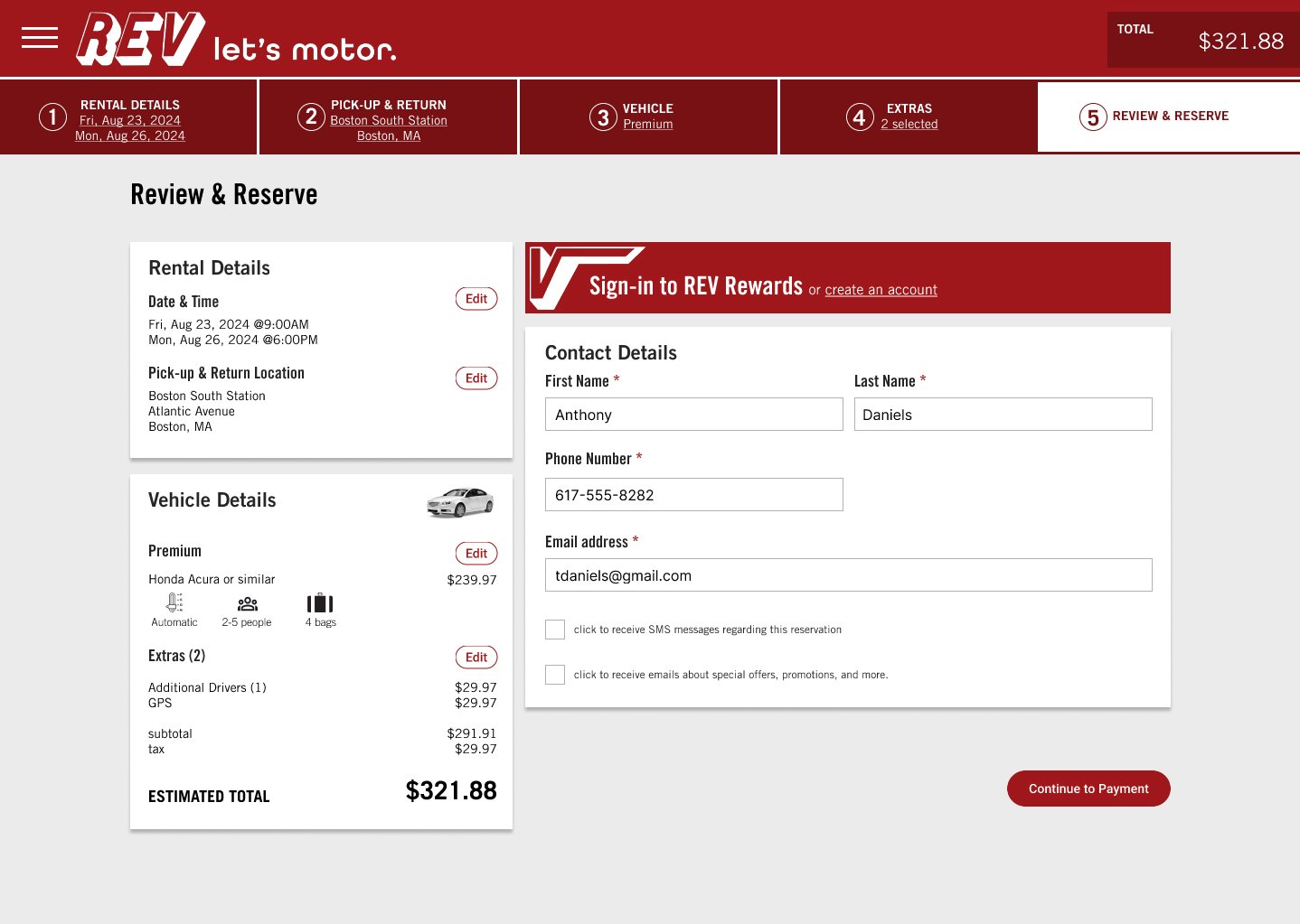
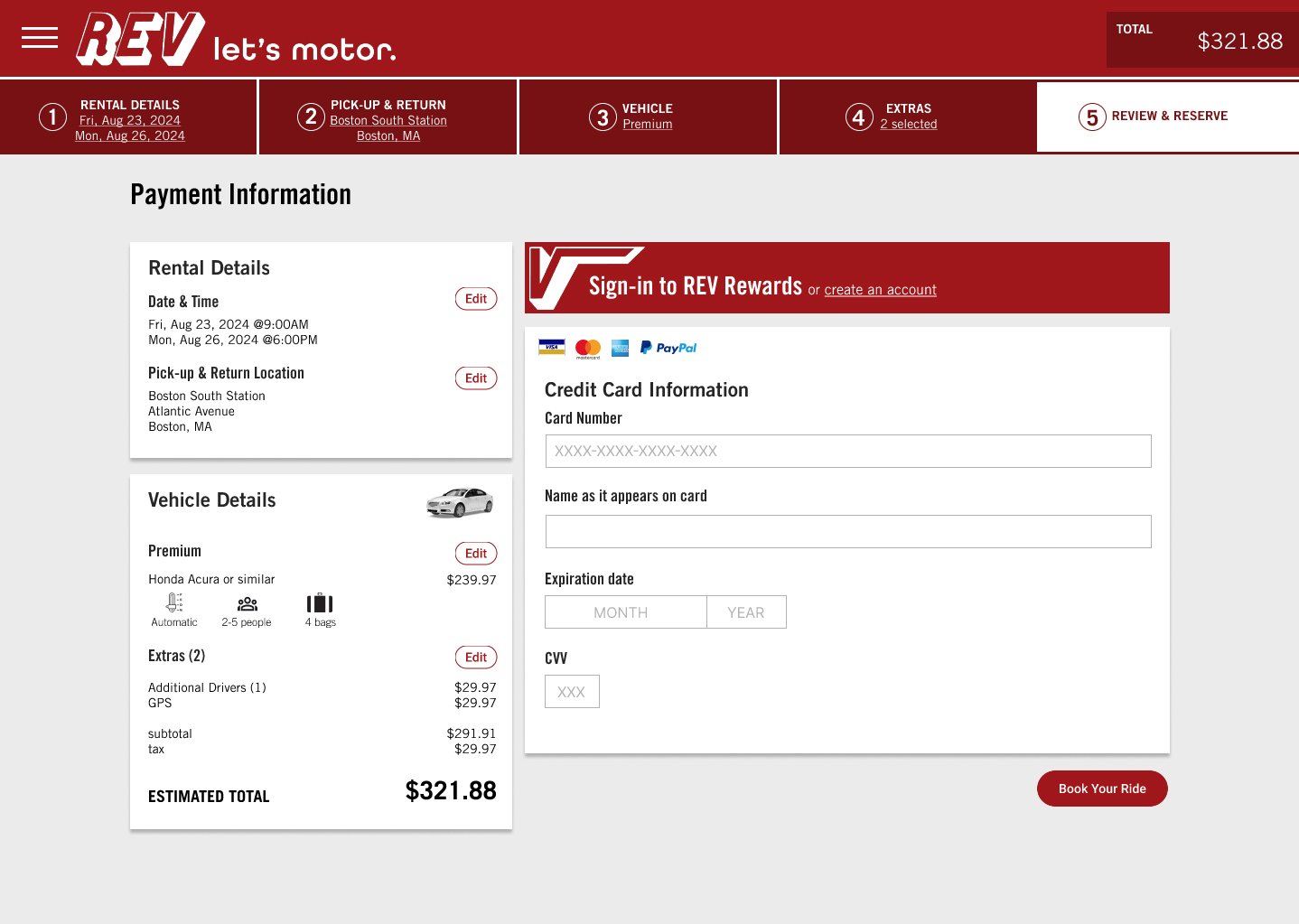
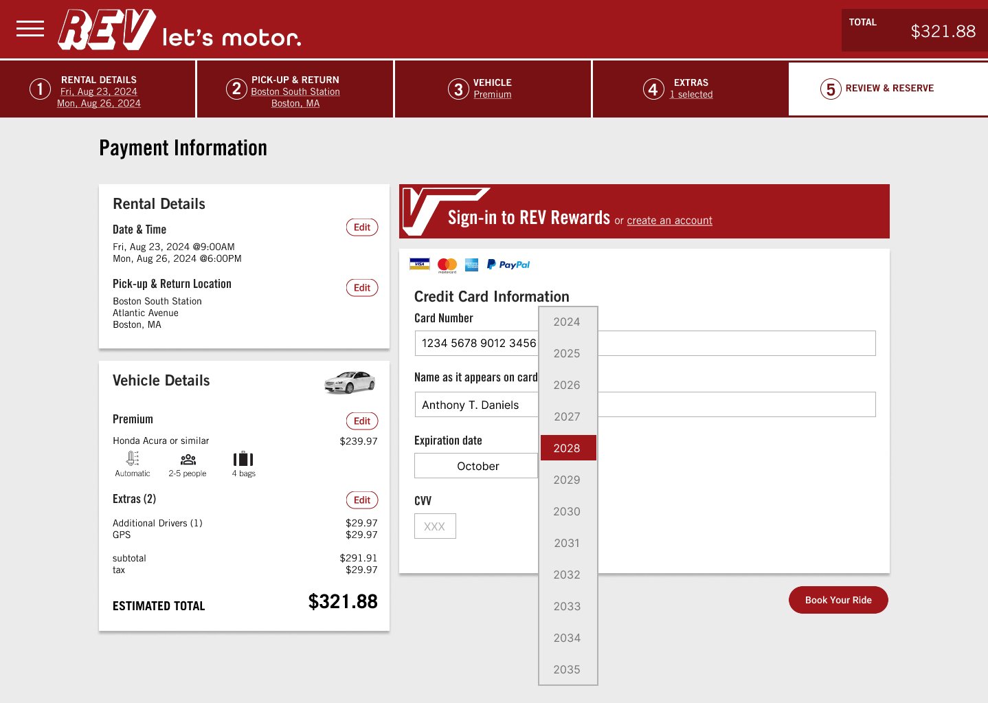
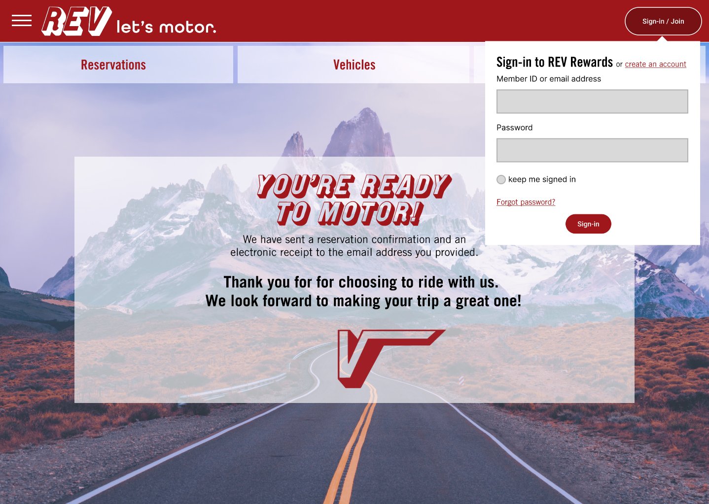
Checkout and Payment screens including the option to log-in or create a user account, and options to edit any aspect of the order such as itinerary and product details


